CASE STUDY · HUBSPOT
HubSpot 2025 Global Rebrand

Growing up without going generic.
ROLE
Head of Brand Development & Enablement, rebrand leadership team
SCOPE
Brand positioning, verbal and visual identity, product brand architecture, rollout across marketing, enablement
PARTNERS
VP of Brand, Brand Strategy, Design, Video, Web Development, Product, and Agency Partners (Kurppa Hosk & Vayner Media)
LAUNCHED
INBOUND 2025
01 · THE CHALLENGE
The brand that got HubSpot here, wouldn’t get it there.
In 2022, HubSpot built its brand around the Everyman: approachable, human, easy to like. It worked. It sharpened HubSpot's differentiation at a pivotal moment.
By 2025, the business had outgrown it. HubSpot was winning bigger, more complex customers, and a youthful, friendly look didn't signal the maturity or confidence enterprise buyers expect.
Product and marketing had also evolved separately, so the brand people saw in the wild didn't match the product they logged into. That gap cost trust exactly where HubSpot needed it most.
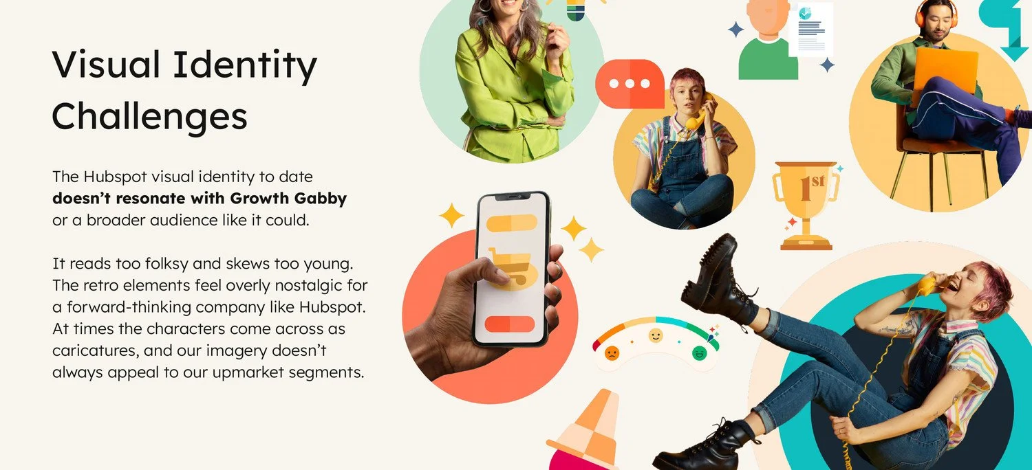
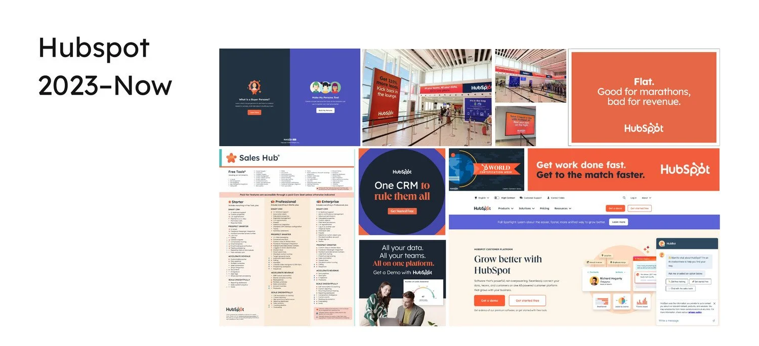
Before: folksy, retro, and skewing young.
HubSpot 2023 to 2025, across marketing touchpoints.
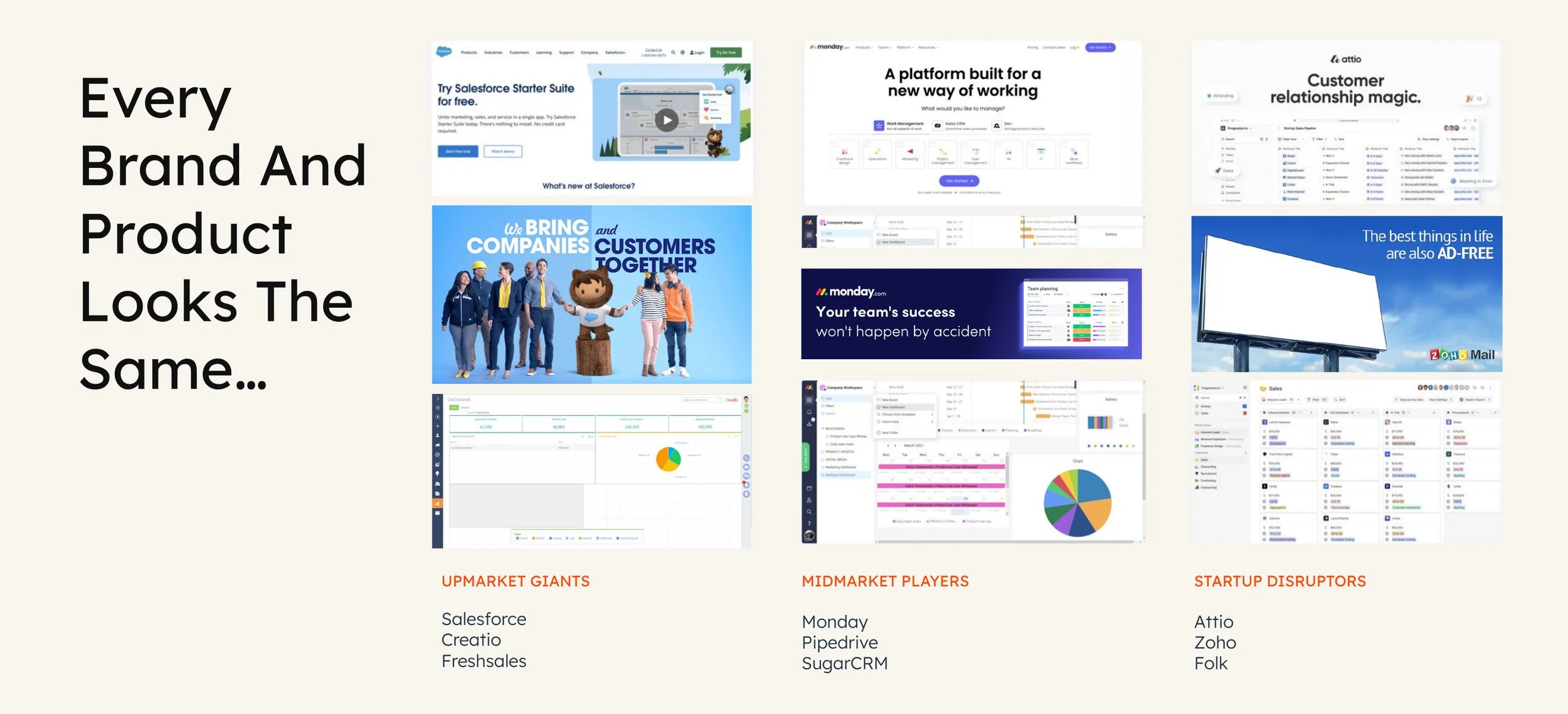
Meanwhile, the whole CRM category continued to converge on one look.
02 · THE TENSION
Keep the warmth. Lose the training wheels.
HubSpot's warmth and human point of view were real advantages. The job was to mature how they showed up: credible enough for enterprise without turning into enterprise software.
03 · MY ROLE
What I Owned
As part of the leadership team guiding the refresh, I turned that tension into a creative direction the company could rally around.
Alignment
Aligned leaders across marketing, product and design on where the brand needed to go.
Operating Model
Built the tools, governance, and rollout plan that carried one standard across a global organization.
Creative Direction
I set the creative bar and held final approval across the identity, shaping the work through direction and feedback from first concepts to launch.
Product Partnership
Partnered with Product to unify the brand and product experience.
Led a team of 17 across design, motion, and brand ops.
04 · THE SYSTEM
Simple at the core. Flexible at the edges.
Logotype
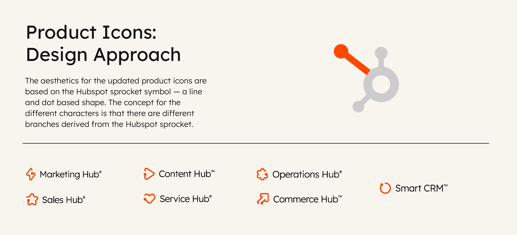
The sprocket, refined to a single color. Product icons branch off its line-and-dot geometry, so brand and product share one visual root.
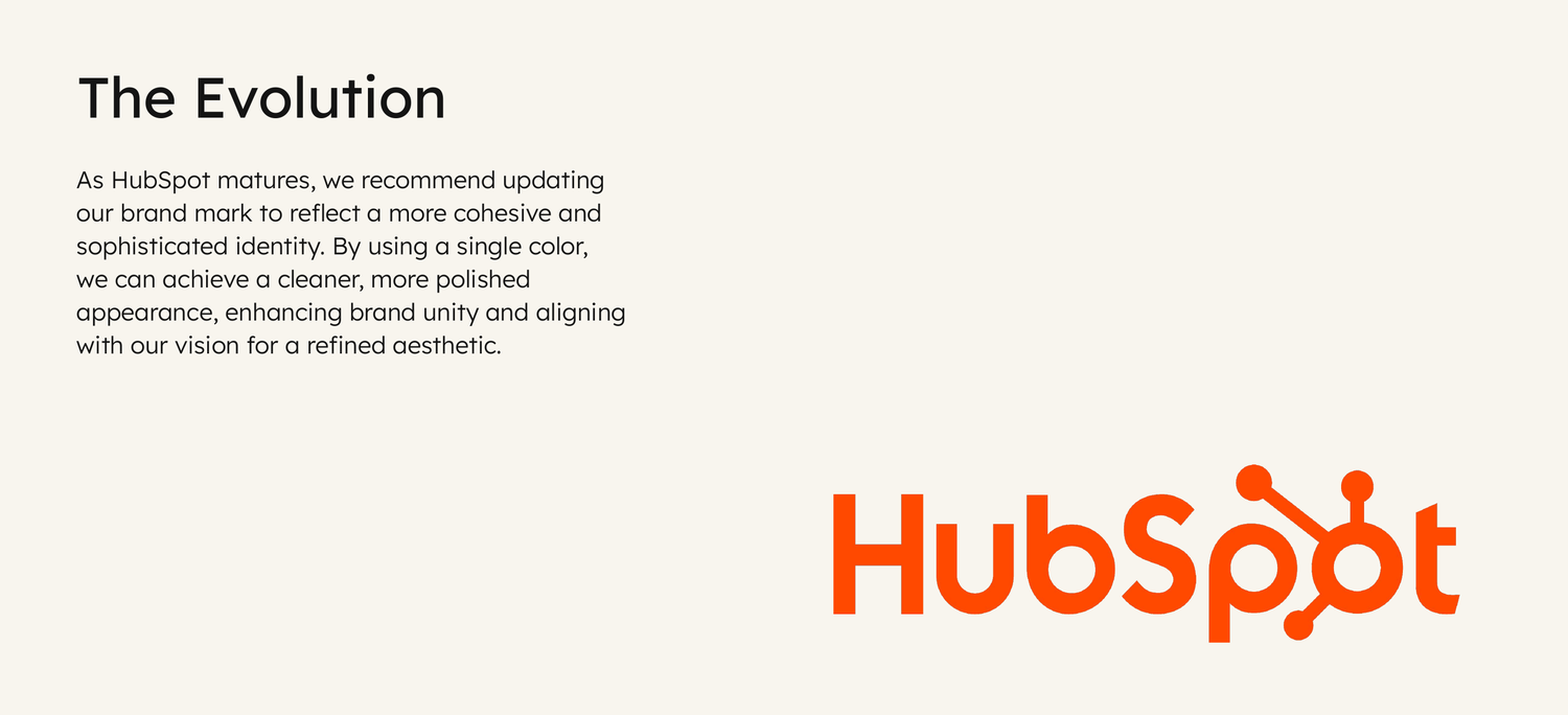
Before
After
Color
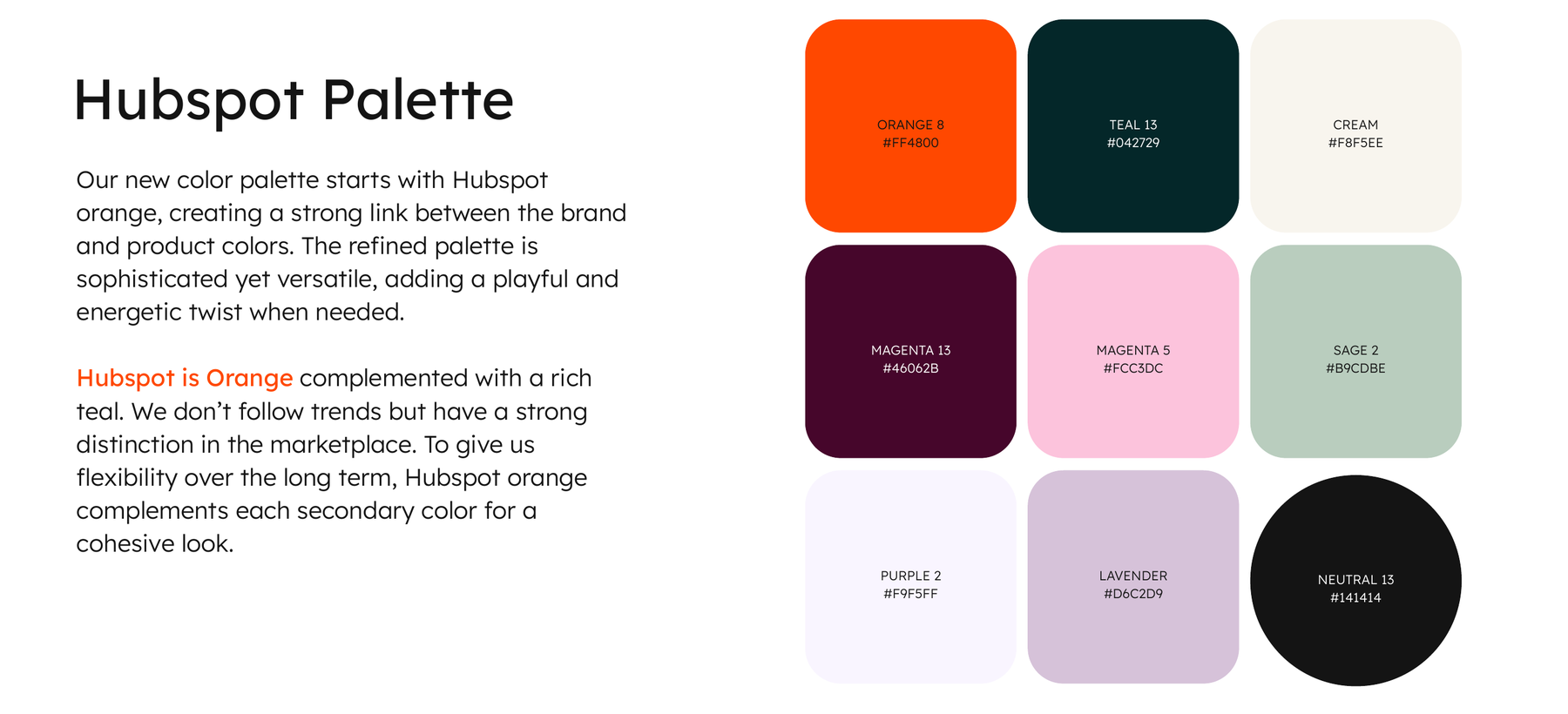
Orange leads, deep teal anchors. One palette for brand and product, with secondary colors that flex from serious to playful.
Shape
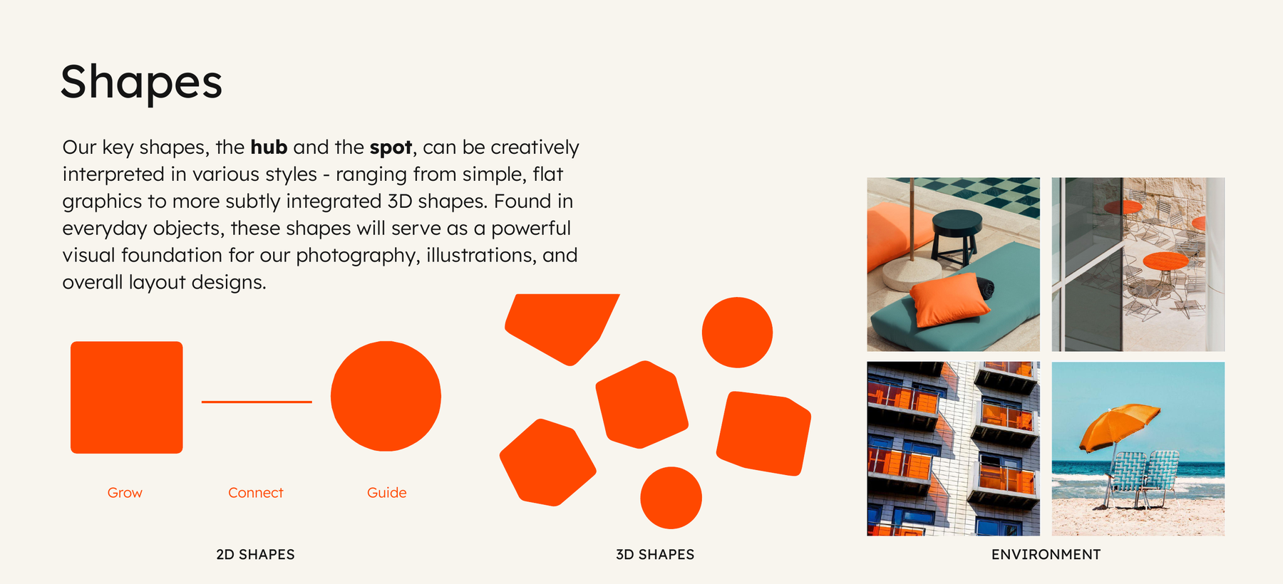
The hub and the spot, mapped to three ideas: grow, connect, guide. They scale from flat graphics to 3D to real environments.
Imagery
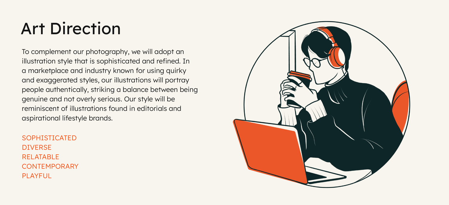
Photography that's candid, warm and naturally lit, with a touch of orange. Illustration that's editorial rather than quirky, in a category full of quirky.
Typography
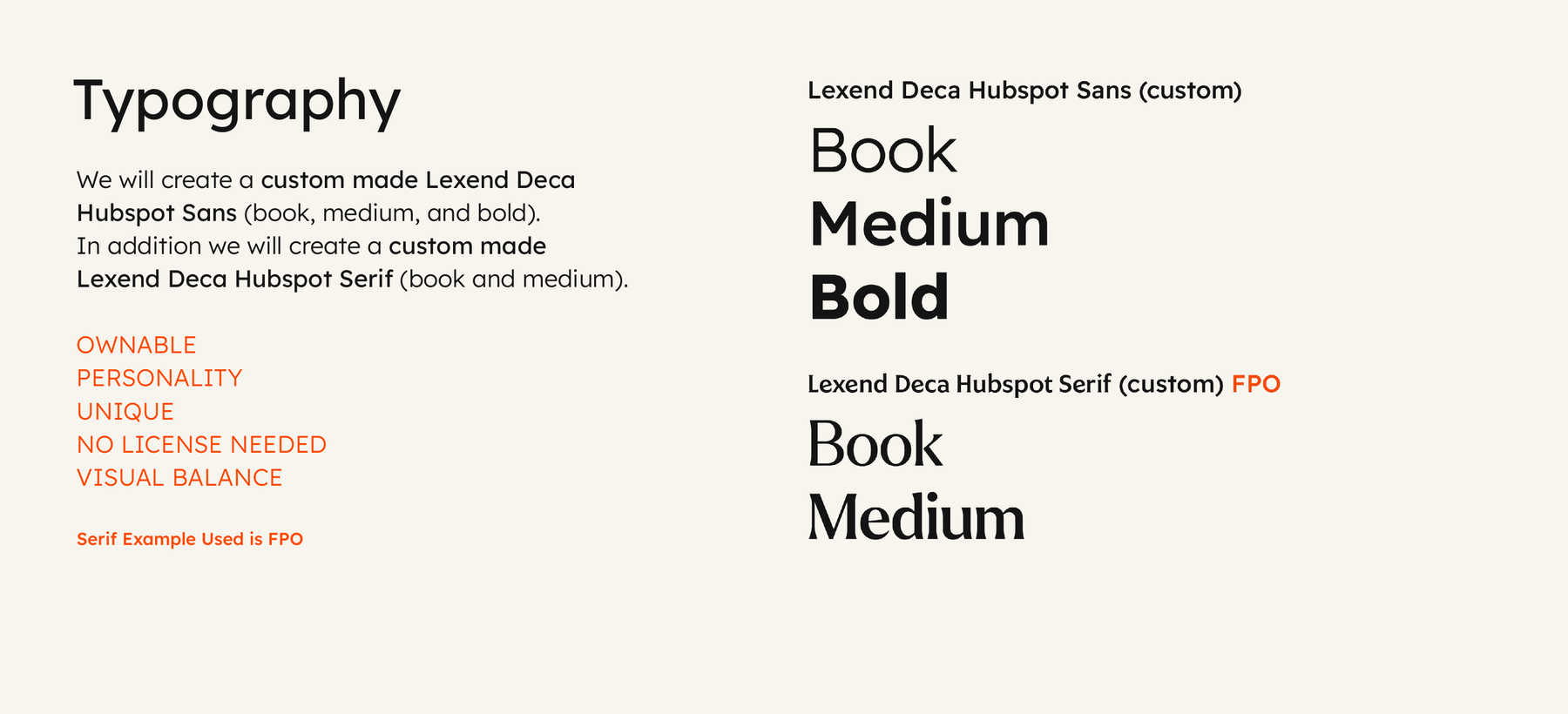
Custom HubSpot Sans and Serif, built on Lexend Deca. Ownable, full of personality, zero license fees.

05 · IN THE WILD
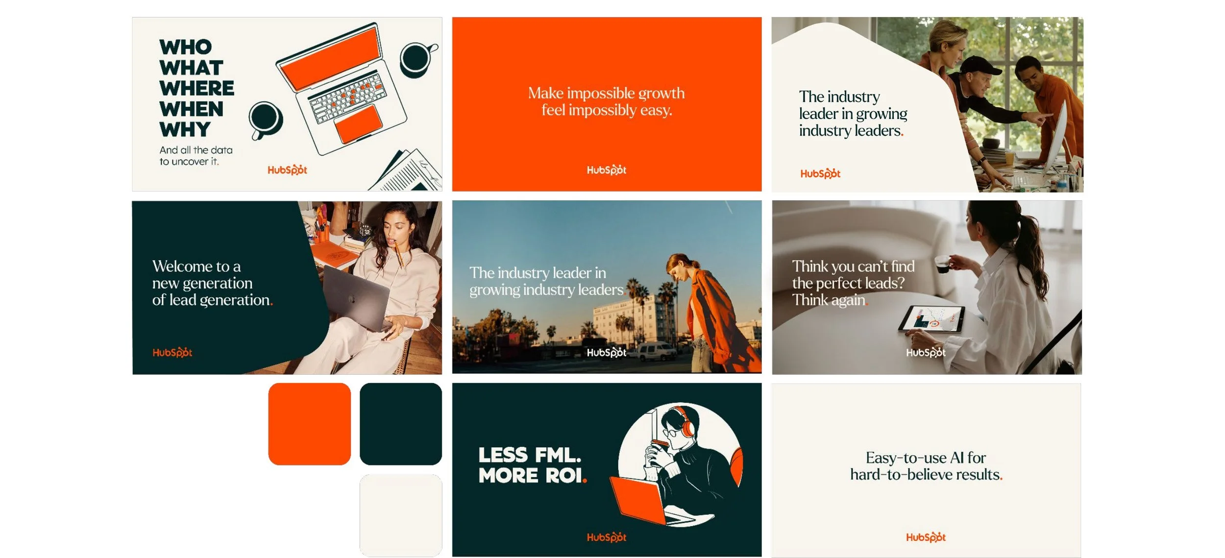
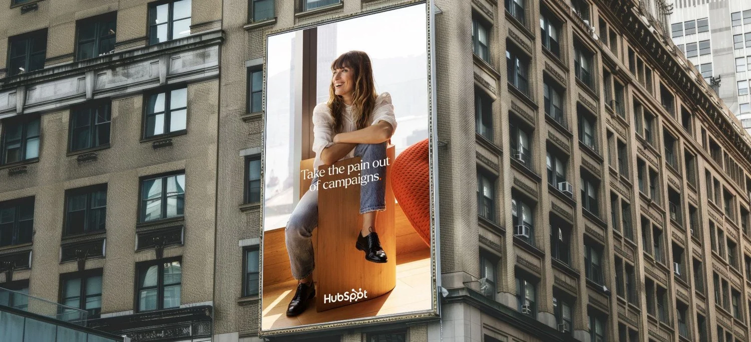
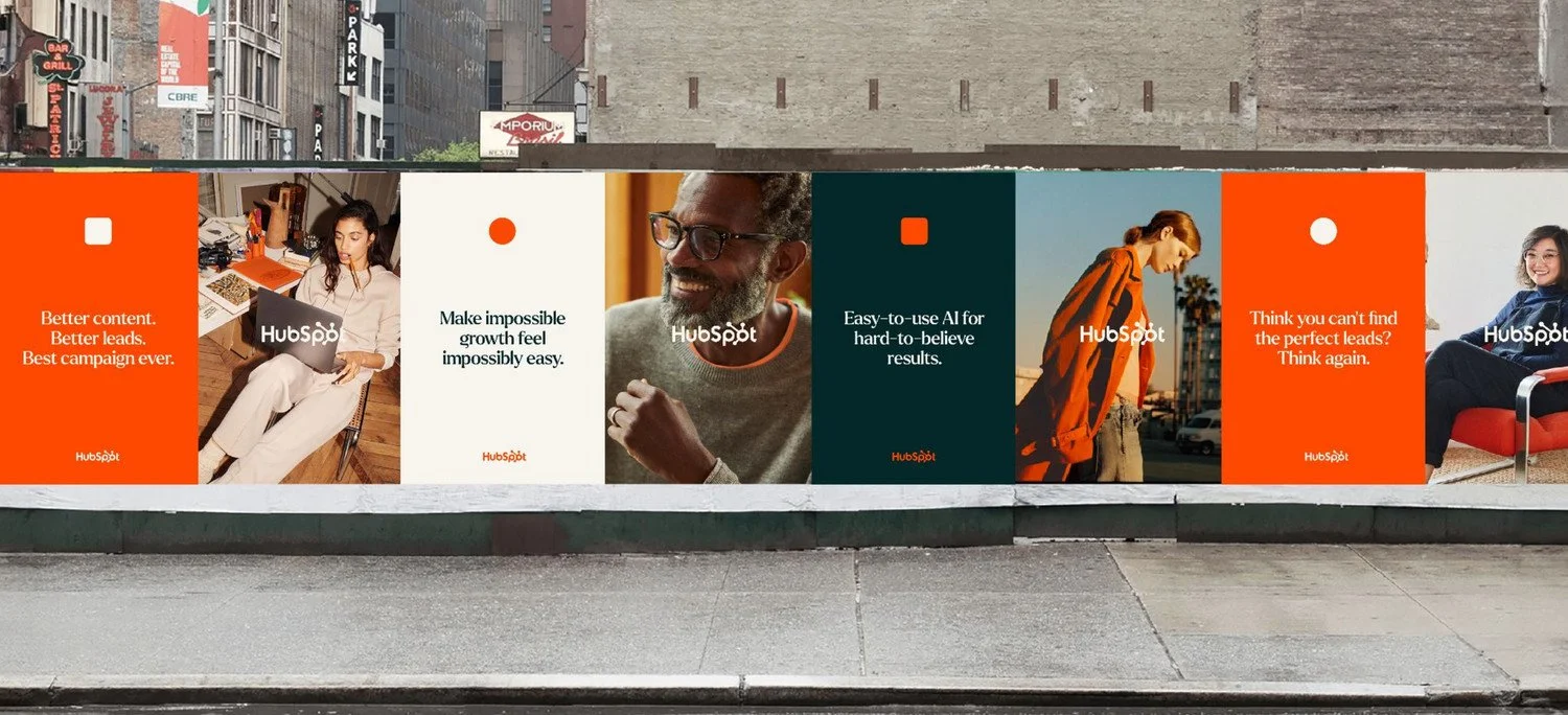
One system. Every surface.
Out-of-home, social, web, environments, and merch.
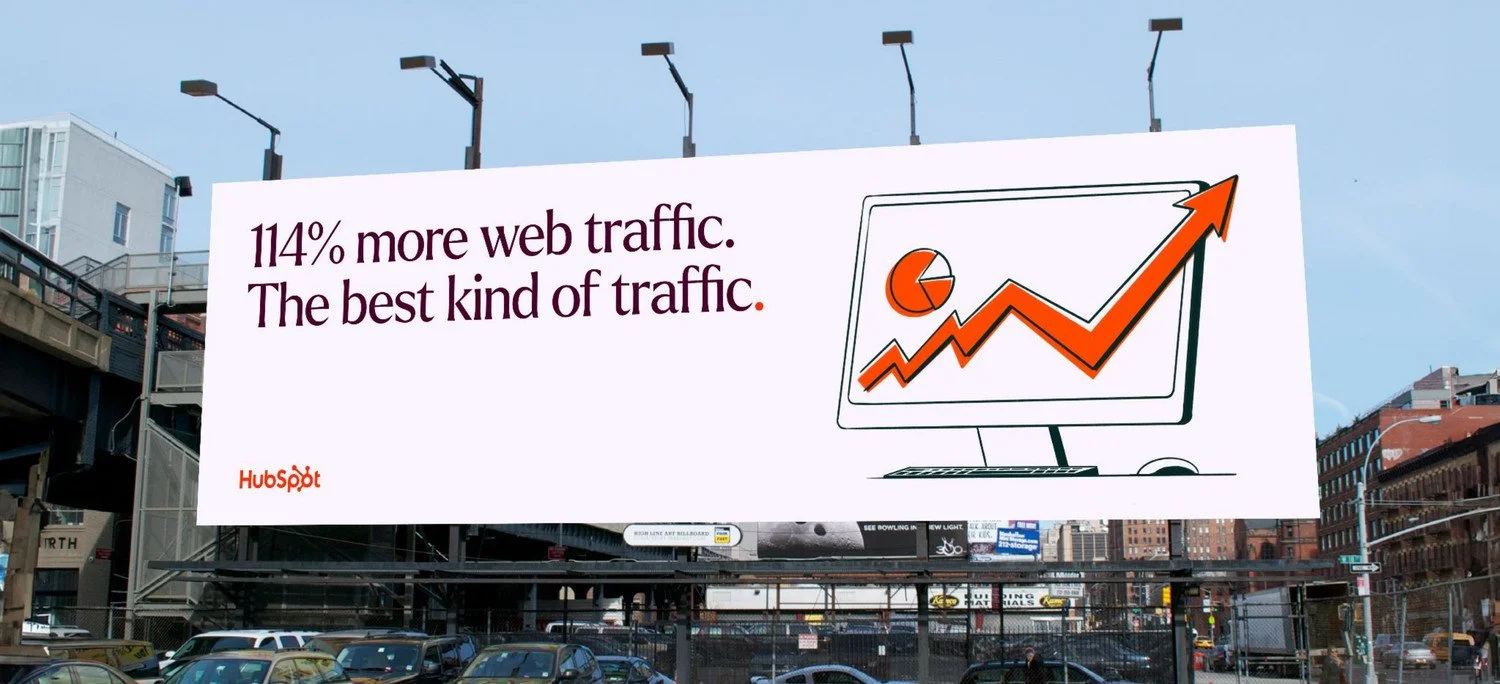
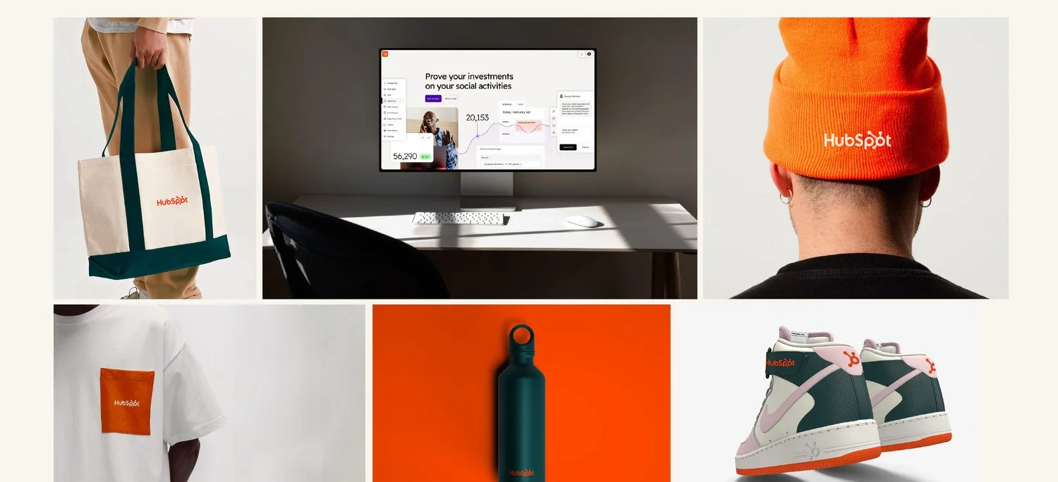
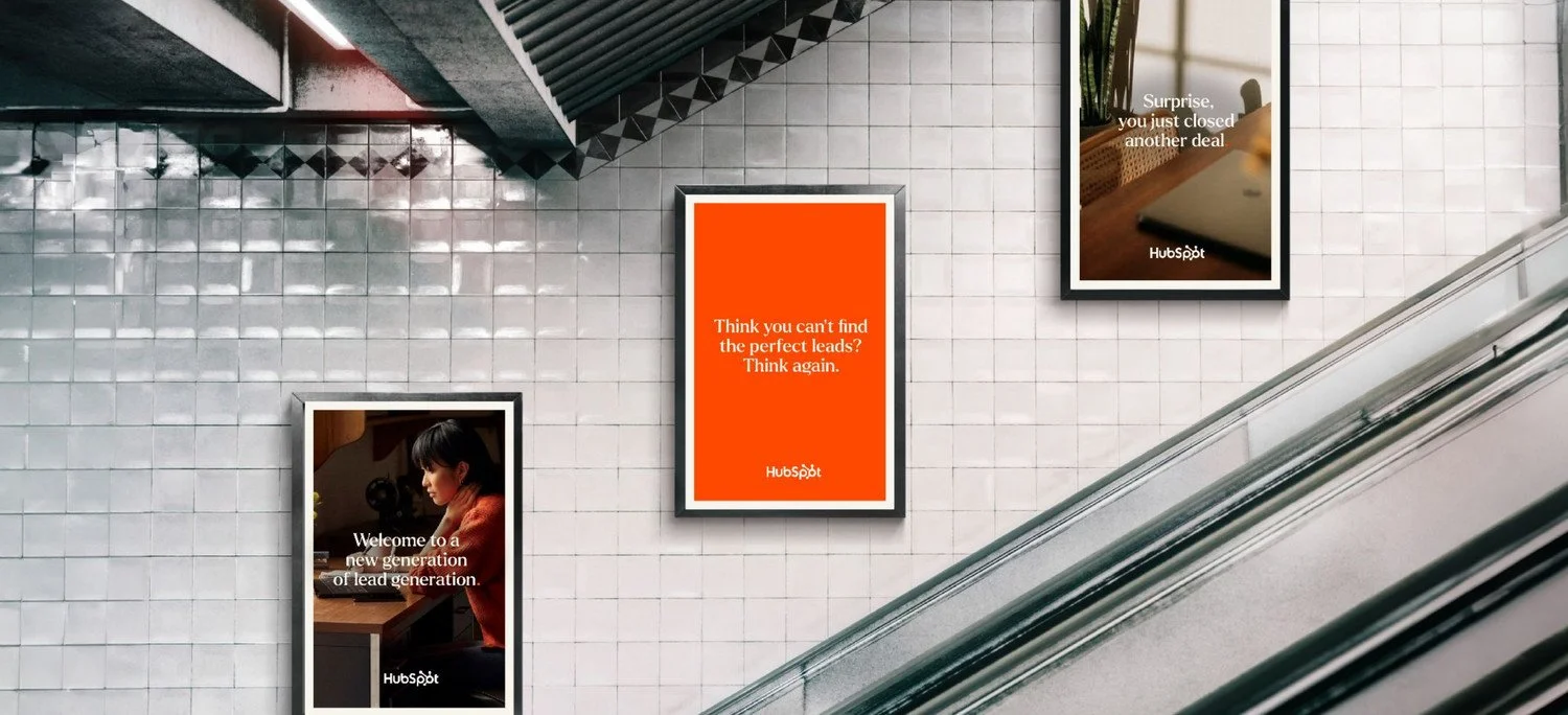
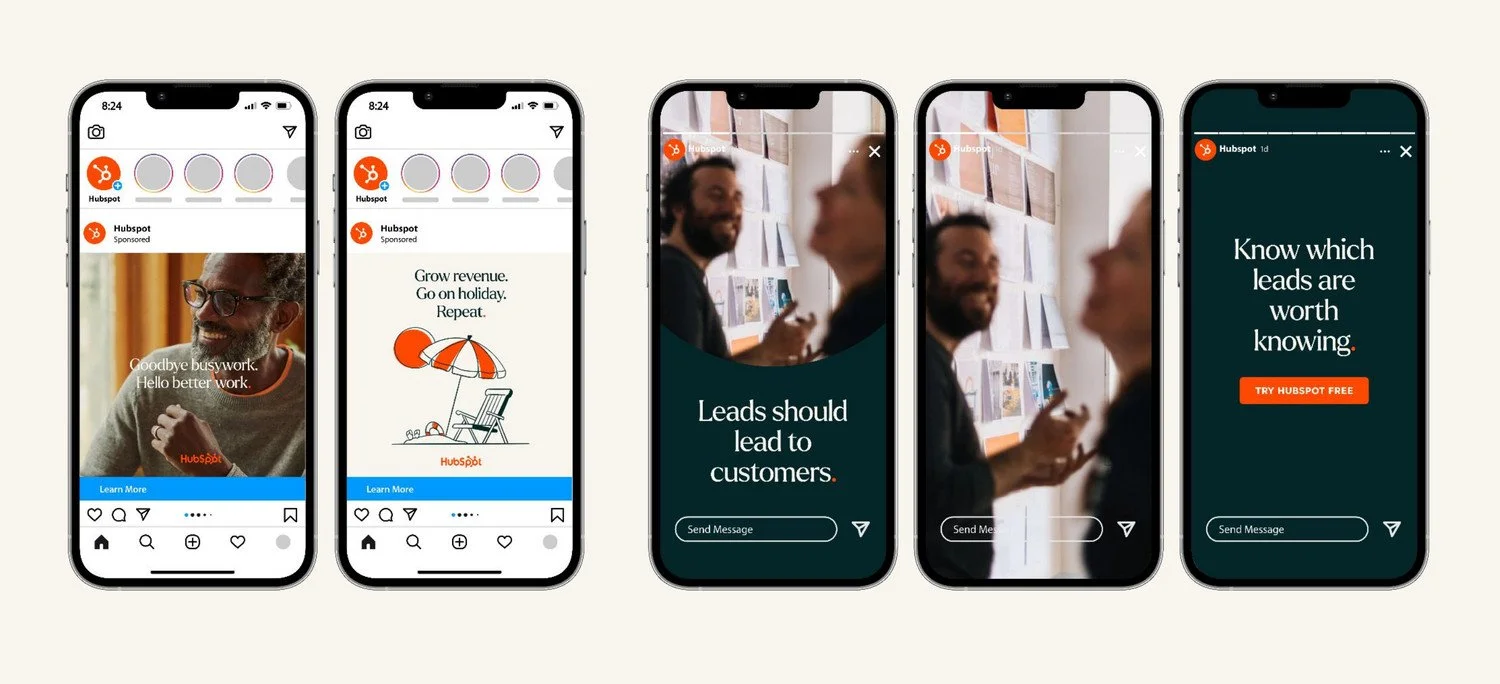
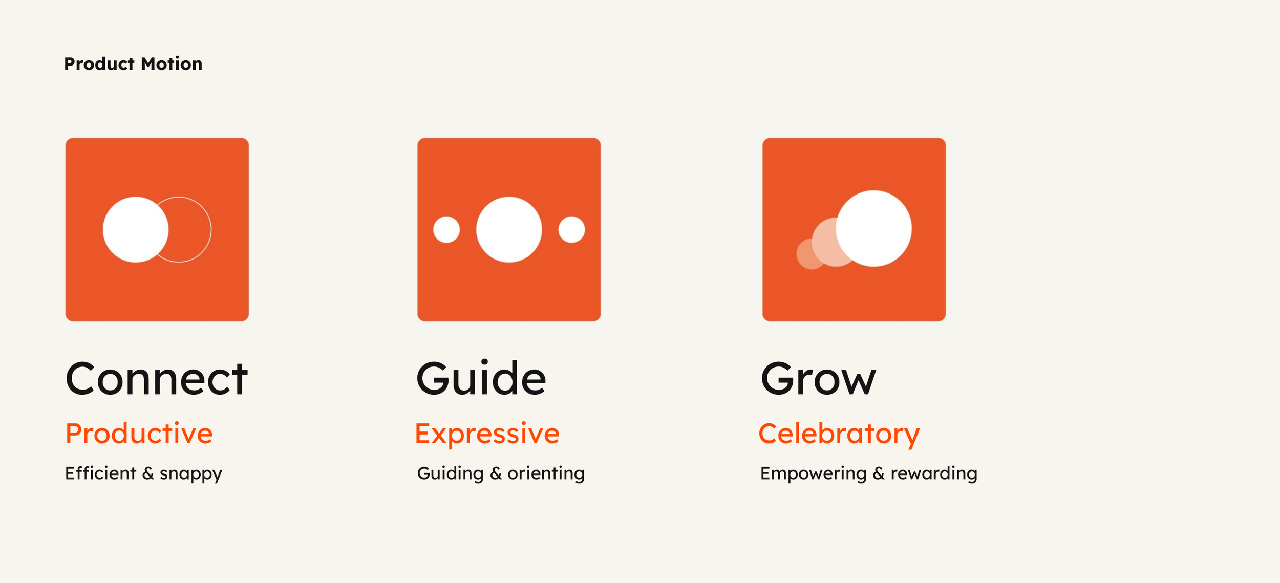
For the first time, brand and product were designed as one system. The new identity became the foundation for a product design language: shared color, type and shape, and motion mapped to the brand's core ideas. Connect is snappy and productive. Guide is expressive and orienting. Grow is celebratory.
Under the hood, the Trellis design system cut 300 components to 75+, was built to WCAG 2.2 AA, and delivered theming and dark mode, one of customers' top 10 requests.
06 · BRAND MEETS PRODUCT
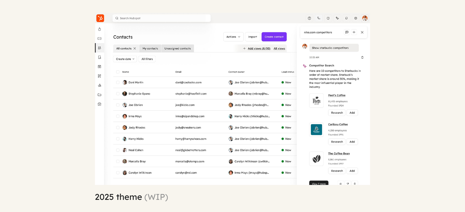
The brand doesn't stop at the login screen.
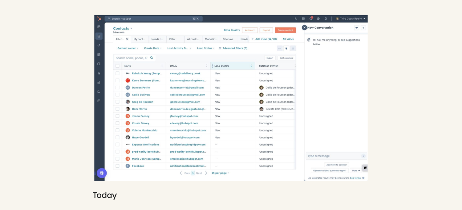
Before
After: the 2025 theme
07 · MAKING IT STICK
A rebrand is only as good as its rollout.
Most refreshes look great at launch and then drift. We planned this one to hold: crawl, walk, run. Define one direction in 2024. Build the infrastructure and pilot it in 2025. Migrate every product team from 2026 on.
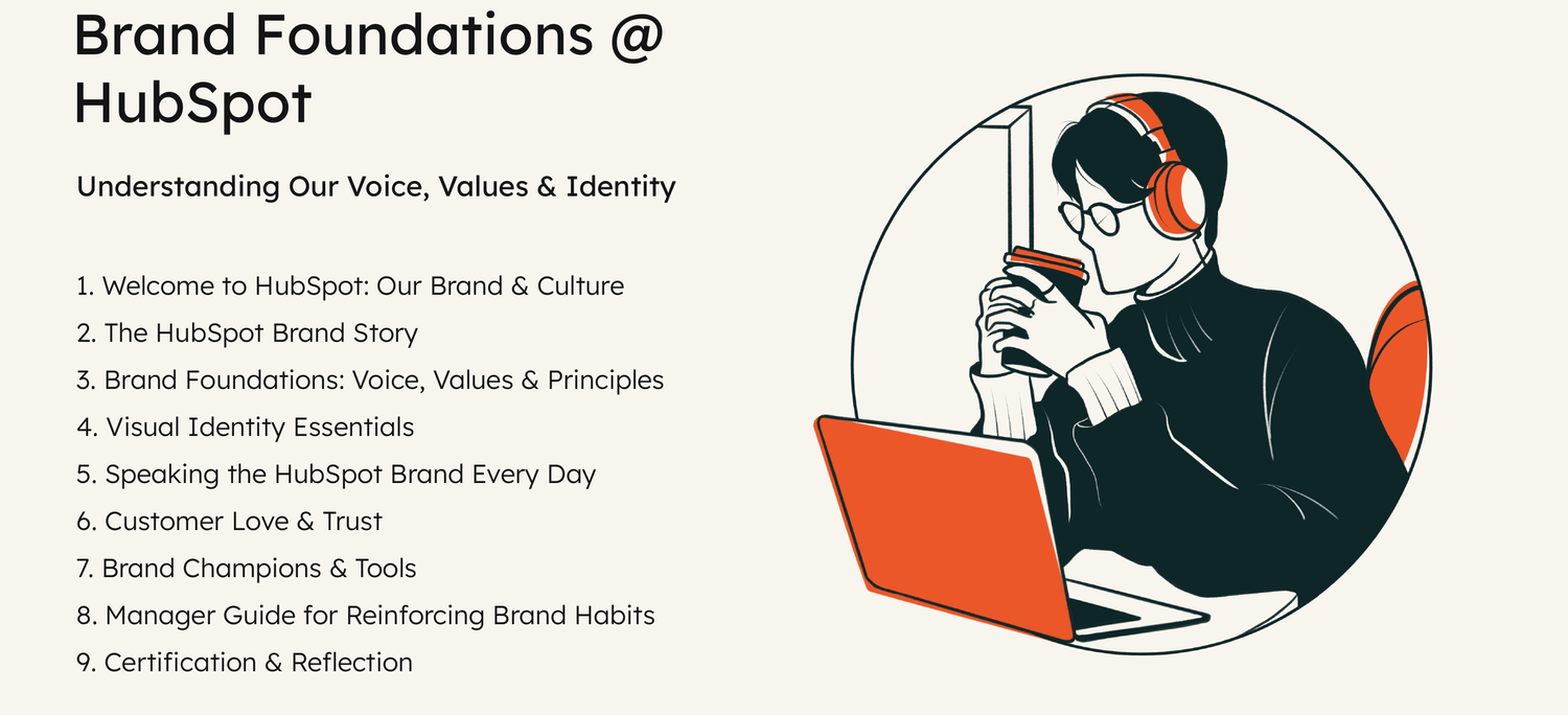
Governance and enablement did the rest. My Brand Development & Enablement program taught teams the voice, values and visual essentials, and brand champions carried the standard into their own teams.
We updated hundreds of templates, cleaned up the DAM, and created a brand training program for all employees.
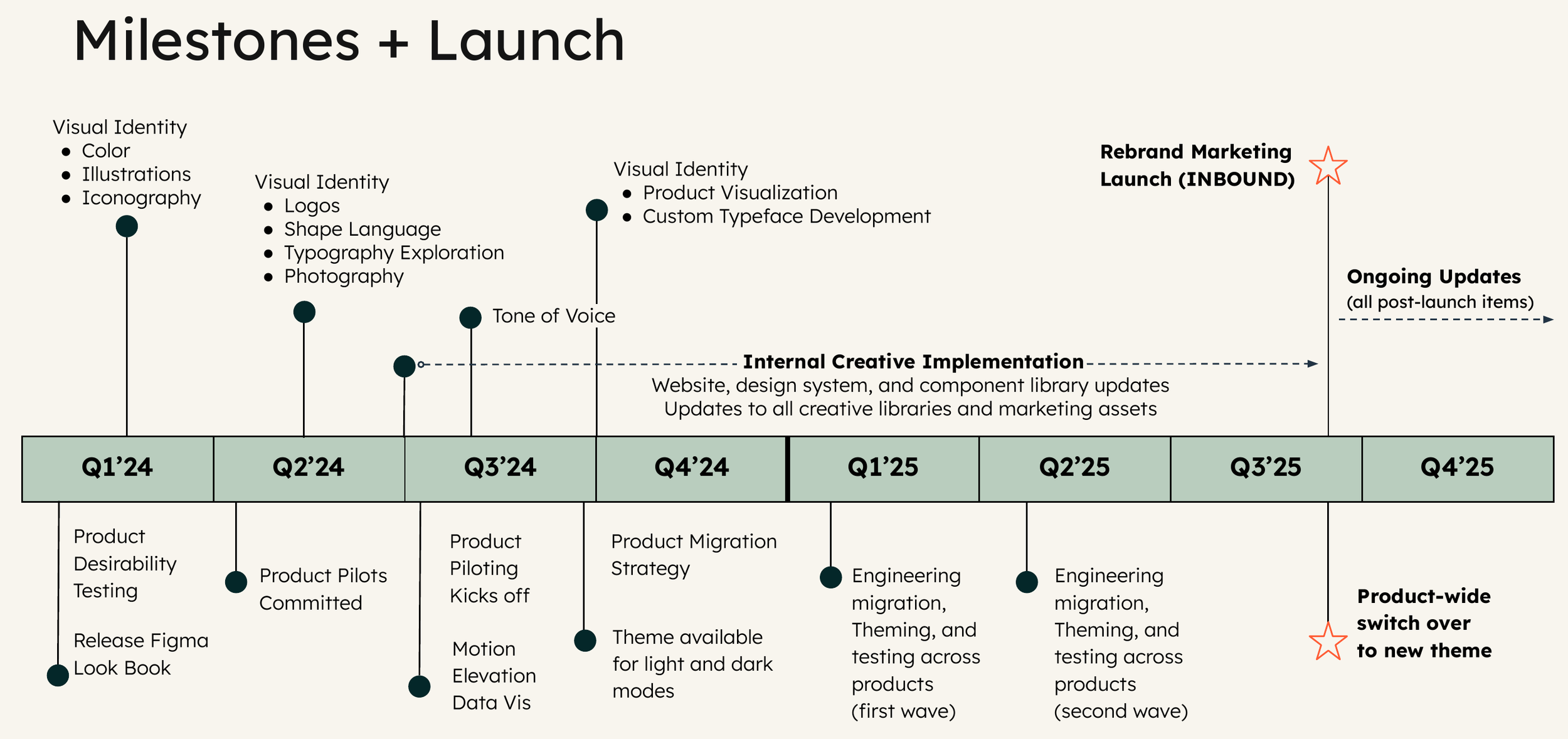
Milestones from first exploration to product-wide migration.
08 · THE RESULTS
1st
Unified brand and product experience in HubSpot's history
75
Core design system components, consolidated from 300
2.2 AA
WCAG accessibility standard
"HubSpot's new brand is minimalist, sleek, and mature."
— Leigha Kristoff, Creative Director at Agency EA, producer of INBOUND 2025, in BizBash
Tie the brand to the product's design system from day one. That's what turned a new look into a new standard.
WHAT I’D DO AGAIN