CASE STUDY · HUBSPOT
HubSpot Component Library
Change it once. Update it everywhere.
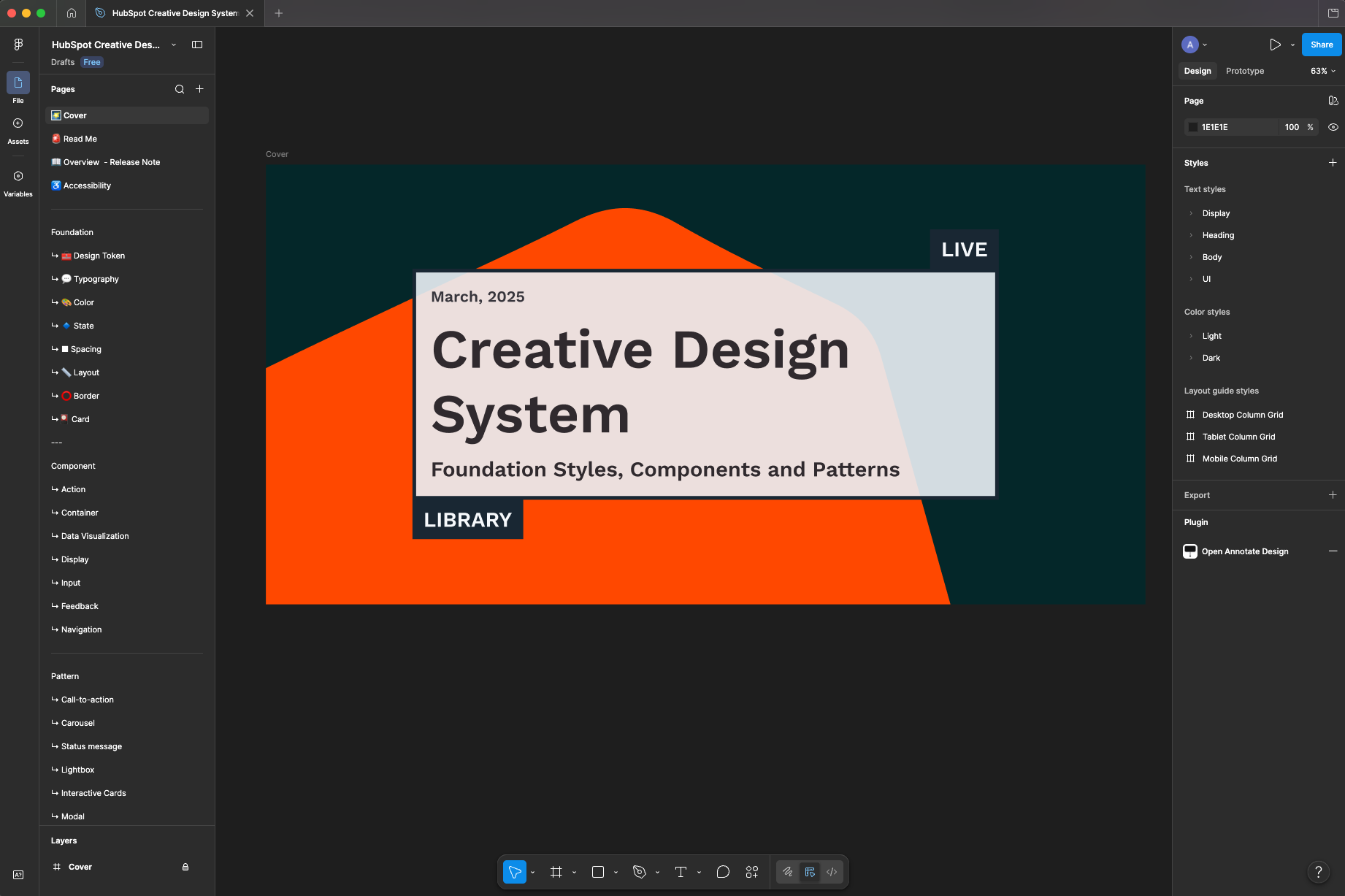
The library today: foundations, components and patterns in one shared source of truth.
ROLE
Program lead and design approver
SCOPE
Business case, roadmap, sprint planning, design review, and approval
PARTNERS
Designer, web development, project management · Team of 12
TIMELINE
Kicked off July 2020, phased rollout from there
HubSpot's marketers built web pages from a style guide of modules. The system had three problems.
No flip of a switch. Rolling out a single brand change globally took so much effort that design and tech debt piled up with every update.
Too rigid to use. The style guide didn't have the modules designers and developers needed, so they built custom work around it.
Too slow for marketers. The brand team couldn't keep up with requests, and module updates shipped about once a year.
01 · THE CHALLENGE
Every brand change was a hand-built project.
Poor design and dev experience
→
Poor marketer experience
→
Poor customer experience
02 · THE IDEA
Build the pieces once.
The plan: build a component library, then rebuild the style guide's existing modules on top of it. Pages already live didn't need a retrofit, so the business never had to stop.
Where it started: the kickoff, July 2020.
03 · MY ROLE
What I owned
I took the component library from idea to production: I built the case, sold it to leadership, and ran the program that delivered it.
The business case
Defined the problem, goals, KPIs and risks, and won creative leadership's sign-off on a phased investment.
The quality bar
Reviewed and approved the design of every component and module before it shipped.
The program
Owned the roadmap across design and engineering. Wrote the Jira tickets, prioritized the backlog and ran two-week sprints, keeping the Figma library and the Storybook build in sync.
The operating model
Set up proposal processes for new components and modules, status reporting every sprint, and a retro at the end of every phase.
04 · THE APPROACH
Prove it small. Then scale.
Instead of asking for a big-bang rebuild, I broke the work into phases. Each proof point earned the next round of investment, and gave leadership a clear checkpoint to stop if it wasn't working.
PHASE 1
Component proof of concept
Five or more components designed and built in seven two-week sprints, then signed off by creative leadership.
PHASE 2
Style guide proof of concept
A real style guide page rebuilt from components, with at least five existing modules, plus a pilot of the new component process.
PHASE 3 - 5
Build out and open up
Prioritized modules built on the new foundation, with proposal processes open to designers, developers, and marketers.
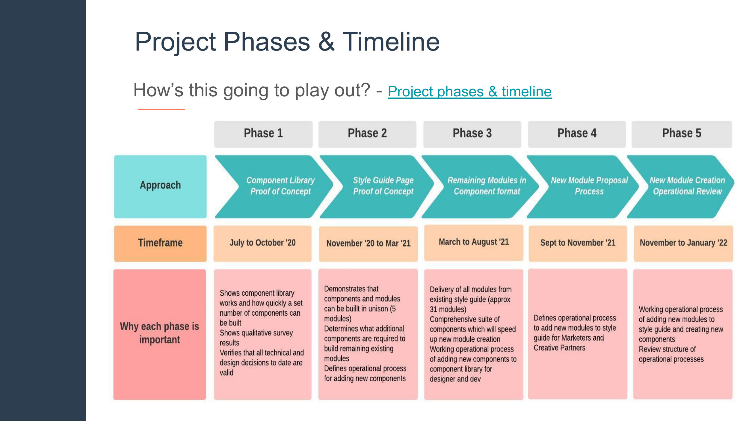
The phased plan, as presented at kickoff.
Foundations first: design tokens with a clear naming taxonomy, a type scale, a spacing scale and a responsive column grid. Components built on top, like buttons in every size and state for light and dark. Patterns on top of those, like cards, carousels and calls to action. Every component had a matching coded version, so what designers used was exactly what shipped.
Change a token, and the change flows through every component, module and page that uses it. That's the flip of a switch. We built it twice, in parallel: in Figma for designers and in Storybook for developers.
05 · THE SYSTEM
From tokens to templates.
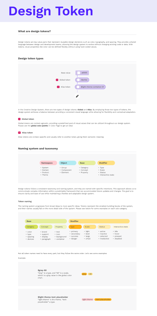
Tokens. Global and alias tokens with one naming system for design and dev.
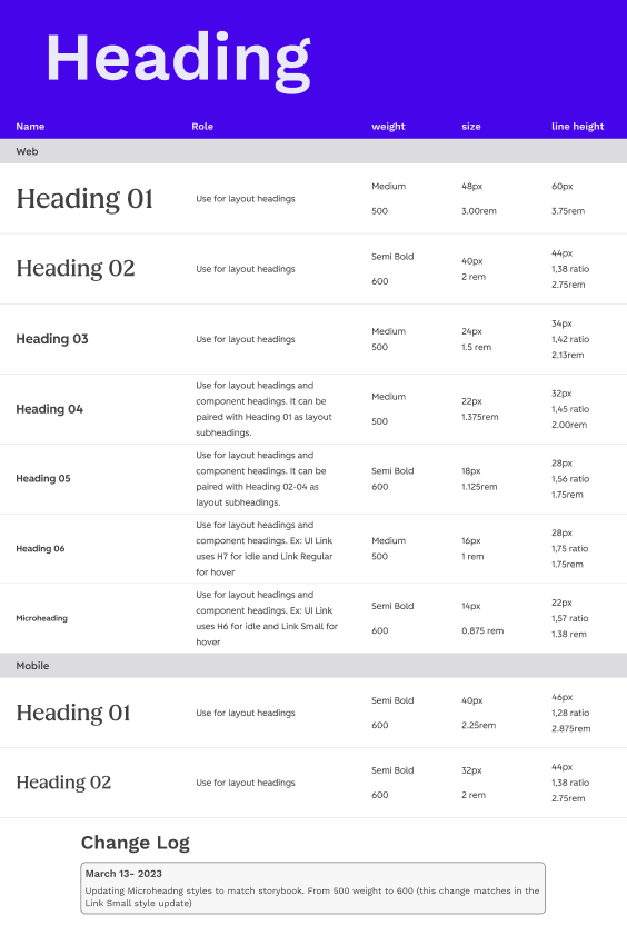
Type. A documented scale for web and mobile, with a change log.
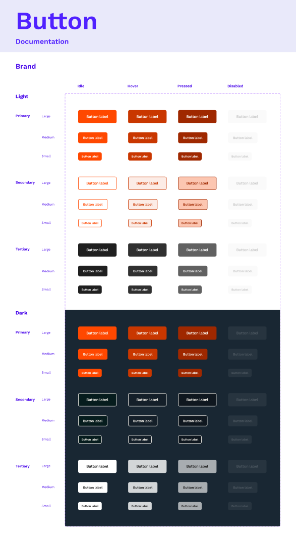
Components. Every size, state and theme, defined once.
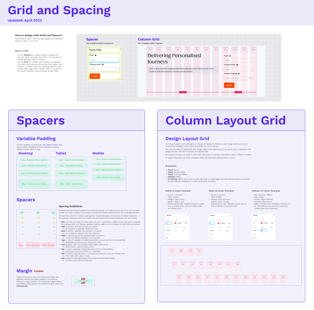
Grid and spacing. Clear rules for when to use spacers and when to use the grid.
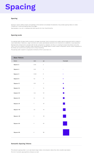
Spacing. One scale, 2px to 96px.
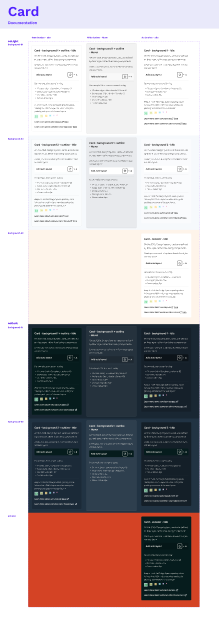
Patterns. Cards across every background.
06 · MAKING IT STICK
Built to keep changing.
A library only works if it keeps up. We replaced once-a-year module updates with a steady release cadence, set a two-week turnaround for bugs, and opened proposal processes so the people using the system could shape it. Every phase ended with a retro and a revised plan for leadership.
Release cadence
From one module update a year to a target of 10 to 15.
Open proposals
Designers, developers, and marketers could all request new modules and components.
Visible progress
Status reports every sprint and retros every phase kept leadership bought in.
20%+
faster design and development on web projects
07 · THE RESULTS
12
module releases a year, up from 1
31 → 41
All 31 existing modules rebuilt from components, and the library kept growing
5+ yrs
still the foundation of HubSpot's creative design system
Nobody funds a component library. They fund faster launches and fewer broken pages. Sell the outcome, then build the system.
WHAT I’D DO AGAIN